
Display Layout Workflow Usage
Display Layouts can be managed from within Workflows. There are two levels for these objects: the top-level Display Layout object, and the nested individual Display Layouts configured for the project.
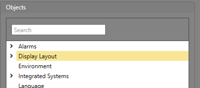
Top-Level Display Layout Object Properties
The properties are for the top-level Display Layout object in the Logic Editor.
Triggers
| Triggers | Description |
|---|---|
| Started Runtime | Runtime has started running. |
| Selected Assets Changed | Assets have been selected or deselected. |
Commands
| Command | Parameters | Description |
|---|---|---|
| Deselect All | Deselects all currently selected assets. | |
| Select Assets | Assets To Select — The assets to be selected. | Selects a specific set of assets. These assets must be of the same type, and multi-select must be enabled for the systems. This will not cause Runtime to navigate to another Map. |
| Set Assets Visibility |
Visible — Whether the assets are to be visible (True) or not (False). Assets — Which assets to change the visibility for. |
Sets a specified collection of assets to either be visible or invisible. |
| Set Buttons Caption |
Text — The text to be used for the caption. Buttons — The IDs of the buttons to change the caption for. |
Changes the caption for a specified set of buttons. |
| Set Buttons Fill Color |
Color — The color to set the button to. Buttons — The IDs of the buttons to change the fill color for. |
Changes to fill color of a specified set of buttons. |
| Set Buttons Image |
Image — The image resource to use for the button background. Buttons — The IDs of the buttons to change the image for. |
Changes the background image for a specified set of buttons. |
| Set Buttons On Click Image |
Image — The image to use for the button background when it is clicked. Buttons — The IDs of the buttons to change the on click image for. |
Changes the on click image for a specified set of buttons. |
| Set Buttons Visibility |
Visible — Whether the buttons are visible (True) or not (False). Buttons — The IDs of the buttons to change the visibility for. |
Changes a specified set of buttons to be visible or invisible. |
| Set Drawing Objects Fill Color |
Color — The color to use to fill the shape. Shape IDs — The IDs of the shapes to change the fill color for. |
Changes the fill color for a specified set of shapes. |
| Set Drawing Objects Image |
Image — The image resource to be used for the object. Shape IDs — The IDs of the image drawing objects to be updated. |
Changes the image for a specified set of image objects. |
| Set Drawing Objects Line Color |
Color — The color to set the lines of the shapes to. Shape IDs — The IDs of the shapes to change the line color for. |
Changes the line color for a specified set of shapes. |
| Set Drawing Objects Line Thickness |
Thickness — The line thickness for the shape in pixels. Shape IDs — The IDs of the shapes to change the line thickness for. |
Changes the line thickness for a specified set of shapes. |
| Set Drawing Objects Text |
Text — The text to set for the label object. Shape IDs — The IDs for the label objects to set the text for. |
Changes the text value for a specified set of label drawing objects. |
| Set Drawing Objects Text Color |
Color — The color to set the text of the label object to. Shape IDs — The IDs of the label objects to set the text color for. |
Changes the text color for a specified set of label drawing objects. |
| Set Drawing Objects Visibility |
Visible — Whether the drawing object is visible (True) or not (False). Shape IDs — The IDs of the shapes to change the visibility for. |
Properties
| Property | Description |
|---|---|
| Item ID | The unique identifier for this item. |
| Item Type | The Type of item this is. |
| Last button pressed event | The last occurring button pressed event. |
| Name | The value for this property is the Description configured via the property grid when the item is selected in Designer. |
| Selected asset Ids | A list of the Ids currently selected in Runtime. |
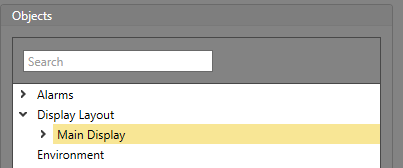
Properties for Nested Display Layouts
The properties are for the nested Display Layouts in the Logic Editor.
Triggers
| Triggers | Description |
|---|---|
| Clean Screen Started | The Workstation has entered clean screen mode. |
| Clean Screen Completed | The Workstation was in clean screen mode, and the timeout period has completed. |
| Clean Screen Cancelled | The Workstation was in clean screen mode, but it was cancelled. |
Commands
| Command | Parameters | Description |
|---|---|---|
| Start Clean Screen | Seconds — The number of seconds screen cleaning mode is active before automatically timing out. | Enters a mode intended for when the Runtime operator needs to clean a touch screen monitor. This mode makes the objects on the Display Layout non-interactable to ensure there are no unintended clicks registered. It automatically times out after the configured number of seconds. |
| Cancel Clean Screen |
Seconds — The number of seconds before screen cleaning mode is cancelled. Color — The color the screen turns to warn the user that screen cleaning mode is about to be cancelled. |
Cancels screen cleaning mode early. This can be used in the event that this mode is active, but an urgent event (such as a duress) occurs which requires the Runtime operators immediate attention. |
Properties
| Property | Description |
|---|---|
| Item ID | The unique identifier for this item. |
| Item Type | The Type of item this is. |
| Background | The image displayed in the Background for this Display Layout. |
| Clean Screen Active | Whether clean screen mode is currently active (True) or not (False). |
| Clean Screen Timeout | The amount of time left in the clean screen timeout. If clean screen mode is not active, this value is zero. |
| Height | The vertical height of the item in pixels. |
| Name | The value for this property is the Description configured via the property grid when the item is selected in Designer. |
| Width | The horizontal length of the item in pixels. |