
Advanced Mode
Advanced Mode lets you create custom icons and attributes for supported integrated systems to build new asset visuals and states in Designer.
Setup
- Genetec Security Center
- Harding DXL
- IPFusion OPC
- IPFusion PLC Devices
- IPFusion SNMP
- IPFusion Workstations
- Senstar Network Manager
Asset Types
Asset Type Settings
In Advanced Mode for an integrated system, custom asset types are created on the Configuration page. These settings define the asset's visuals based on different conditions and determine how its icon appears. Once created, the icons can be dragged from the Toolbox onto a Map.
- Selected — This element shows when the asset is currently selected to provide visual feedback for the Runtime operator.
- No Communication — This element shows when Runtime cannot get status for the asset's status tag. This element cannot be deleted.
- Masked — This element shows when the asset's true state has been masked over.
You can see how to create asset types here.
Asset Type Settings
| Property | Description |
|---|---|
| Asset Type ID | The unique identifier of the asset type. |
| Asset Type Name | The name of the asset type. |
| Background Color | The background color of the asset. |
| Caption Color | Select Edit Caption Colors to configure the color settings of the asset. |
| Caption blinks when asset is in Alarm | Check this option to have the caption text blink when the asset is in an alarmed status. If caption text flashing is also enabled, this will override it and the text will blink instead. |
| Icon Size | The size of the asset. Note: When Scale
Elements with Icon Size is enabled, all
elements in the icon scale proportionally when the asset
icon size changes. When disabled, elements keep their
original size and are not affected by asset icon size
changes. |
Edit Caption Colors
- To configure the color of the caption on the icon, click on the Edit Caption Colors button.
- Click Add and create a new Caption Mode. Fill in the chart according
to the different fields:
Property Description Bind Caption Color to Highest Priority Alarm Text Color When enabled, the caption color is determined by the highest-priority active alarm type across all currently visible layers. The asset's caption will use the Text Color of the alarm as defined in Alarm Management. Active alarms will override any expressions defined below regardless of priority. Priority The priority of the color expression. A lower number indicates a higher priority (1 is highest, 99 is lowest). Note: If multiple expressions are true in Runtime, the higher priority color will display.Friendly Name A name used to identify or describe the expression. Color The color that the caption will show in Runtime. Flash Color A checkbox that determines whether the Flash Color is used. Expression The expression that must evaluate to true for the specified color to be displayed. Note: If the expression is blank, it will always evaluate to true. - After creating the Caption Mode, adjust its priority using the
arrows to set its placement.
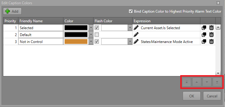
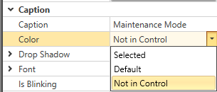
- Find the new Caption Mode under Caption in the
Properties grid.
Alarms
Each element can optionally be bound to an alarm. The alarm is triggered when the element is visible. These settings are located under Selected Element Properties:
| Property | Description |
|---|---|
| Alarm Type | The type of alarm which is fired when this element becomes visible. Note: This will
only take effect if Bind to Alarm
is checked. |
| Bind to Alarm | Check this to bind this element to an alarm when it is visible. Note: When not
checked, the values in Alarm Type
and Is Latched will be
ignored. |
| Is Latched | Check this so that the Runtime operator must acknowledge and reset the alarm before
it is cleared from the asset. Note: When enabled, the alarm
remains active and the element stays visible even if its
visibility expression evaluates to false. The operator must
acknowledge and reset the alarm before it clears. When
disabled, the element always follows its visibility
expression. |
Appearance
An element can have its appearance modified for how it is displayed on the asset icon.
| Property | Description |
|---|---|
| Fill Color | The color which fills the shape/symbol. |
| Flash Fill Color | If Flash is enabled, the symbol will flash between its default Color and this one. |
| Line Color | The color of the shape outline. |
| Flash Line Color | If Flash is enabled, the symbol's outline will flash between its default Color and this one. |
| Text Color | The color of the text. |
| Flash Text Color | If Flash is enabled, the text will flash between its default Color and this one. |
| Is Bound to Alarm Colors | When enabled, the symbol or text will use the color scheme defined by its associated
alarm. Note: This can only be enabled if Bind to
Alarm is checked. |
| Is Flash Enabled | When enabled, the symbol, image, or text will alternate between its default color and
the Flash settings to create a
flashing effect. Note: When Bind to
Alarm is checked, Is Flash
Enabled is always true. While the alarm
is unacknowledged, the layer flashes using its
configured flash colors/images. Once the alarm is
acknowledged, the layer remains visible and stops
flashing. |
Identification
Elements have three main identifiers:
| Property | Description |
|---|---|
| Friendly Name | A name you can define to easily identify this element. This is the name which appears in both the Elements pane and in Workflow browsers. |
| ID | The unique identifier for this element. Note: ID is read only. |
| Logging Description | The description of the element that will be written to the activity log if Include in Activity Log is checked. |
Element Layout
The general layout of a specific element can be configured in its settings.
| Property | Description |
|---|---|
| Height | The height of this element in pixels. |
| Width | The width of this element in pixels. |
| X | The X position of the left of the element. |
| Y | The Y position of the top of the element. |
Settings
These properties depend on the element type you select, but the following are consistent across all elements:
| Property | Description |
|---|---|
| Choose [Element] | Select an element type based on the following options:
|
| Include in Activity Log | The reporting logs show all of the visible elements in the status string for the
asset. Check this box to include the symbol while
visible. Note: Checking the Include in
Activity Log box will write the
element's Logging Description to
the Activity Log. If the Logging
Description is left blank, the
Friendly Name will be used
instead. |
| Visibility Expression Editor | The Visibility Expression Editor allows for the configuration of logical expressions. |
| Visibility Expression Text | The text representation of the configured Visibility Expression. |
Add an Element
When creating a custom asset type, the elements which are displayed can be any of the below types. Multiple elements of varying types can be added to a single asset type. They can each have their visibility changed separately to indicate status to the Runtime operator. See the Element Visibility section for further information.
| Element Type | Options | Description |
|---|---|---|
| Image
|
Choose Image — Select an image resource from the project to be
displayed within this element. Note: Choose Image
Flash is available for elements that are
images. |
An image resource to be displayed on the asset icon. |
| Text
|
Text — The text to be displayed. | Some text to be displayed on the asset icon. |
| SVG (Advanced)
|
SVG File — The file to import from
the File Explorer. This imports the path data from an SVG
file, allowing the fill color to be modified in
Designer. Note: The SVG does not use or create a resource
file because Designer ingests and updates the path data
directly. |
An SVG file to be displayed on the asset icon. |
| Symbol (Recommended)
|
Select a symbol to be displayed from the symbols included in Designer. | A symbol to be displayed on the asset icon. |


Element Visibility
Each element added to an asset type can be set to visible/invisible based on a set of conditions. For more information, go to the Visibility Expression Editor page.
Asset Events
Asset events are events used to trigger Workflow actions on an asset level. For more information about Workflows, see the Workflows section.
Element Changed
Triggered when the elements on an asset update. Only one trigger will fire for Element Changed even if multiple elements are changed at once.
- An element is defined with no visibility expression.
- An element is defined with a visibility expression that yields to false at startup.
- Asset has no elements at all.
Status Word Changed
Triggered when the PLC Status Word changes regardless of whether it creates an element change.