Custom Command Layout
Configuring a Command Table includes an advanced feature where you can customize the look of the command bar as it will appear on the operator's Workstation.
To customize the Command Layout: 
- Go to Integrated Systems, right-click the system to configure and click Configure.
- Go to Command Tables and click the table you want to customize.
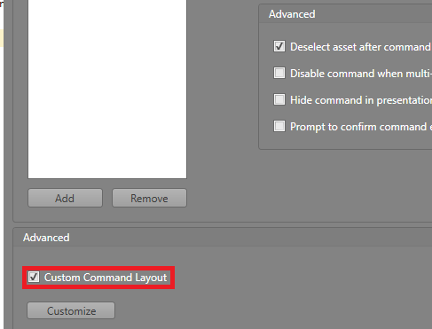
- In the Advanced settings, check Custom Command Layout then click the Customize button.

Warning: When using a custom command layout, you must ensure your
Function Panel is large enough to fit the commands.
If it is not, they will not be displayed properly.
There are two tabs for customizable buttons:
- Command Buttons — Each button represents a command in the table.
- Confirmation Buttons — These are the buttons that appear when the Prompt to confirm command execution option is enabled. There is one to Confirm the action, and one to Cancel.
| Background Color | Click the drop-down and use the Color Picker to select a color for the background of the commands. |
| Display | If you have an image in the background, this setting is how it fills
in the area.
|
| Image Horizontal Alignment | The image's alignment along the horizontal axis. |
| Image Vertical Alignment | The image's alignment along the vertical axis. |
| Height | The height of the background area in pixels. |
| Width | The width of the background area in pixels. |
| Background Color | Click the drop-down and use the Color Picker to select a color for the background of the button. |
| Default | The defaultBackground Image for the button to display. |
| Layout | If you have an image selected, this is how it fills the button.
|
| On Click | The Background Image displayed on the button when clicked. |
| Border Color | Use the drop-down Color Picker to select a color for the button's border. |
| Border Thickness | How thick the button's border is in pixels. |
| Corner Radius | This is used to make the edges more rounded or sharp. The lower the number, the sharper the edge. The higher the number, the more round. |
| Blur Radius | How far the Drop Shadow will fade out from the button in pixels. |
| Color | Use the drop-down Color Picker to select a color for the button's Drop Shadow. |
| Depth | How far in pixels the Drop Shadow extends from the button. |
| Opacity | This affects how visible the Drop Shadow is. The higher the number, the more opaque it is. The lower the number, the more translucent it is. |
| Font | Expand this area to set the styling and size for the text on the button. |
| On Click Color | Use the drop-down Color Picker to select the color the button will be when it is clicked. |
| Height | The height of the button in pixels. |
| Rotation Angle | The angle at which the button is rotated. This value can be manually typed in, or it can be adjusted by dragging the yellow circle above the selected button to rotate it. |
| Width | The width of the button in pixels. |
| X | The location of the button along the X axis. This can be either manually entered in, or adjusted by dragging and dropping the button to the desired location. |
| Y | The location of the button along the Y axis. This can be either manually entered in, or adjusted by dragging and dropping the button to the desired location. |
