Display Block
The Display block is used to show the operator text or an image in Runtime. This is used to prompt the operator with information — e.g., a warning before a command is executed.
Note: The Display block can only be used in
Interactive Workflows.
To use a Display block in your Workflow, follow the steps below.
- In Project Explorer, expand Workflows. Double-click a Workflow to edit. Alternatively, right-click Interactive Workflows to Add one.
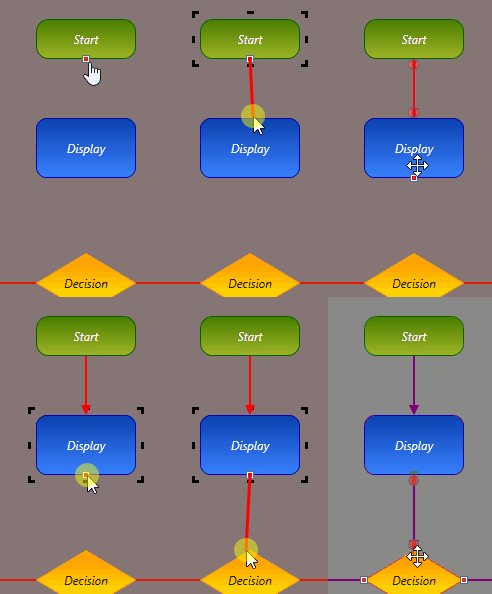
- Drag and drop the Display block into the work area.
-
Connect the Display block to its previous and next
blocks.

-
Select the Display block and configure the
Properties below.
Display Text If you would like to display text with this block, select the Display Text drop-down and type the text to display. If there is a large amount of text being displayed, it is recommended to use the preview option to ensure it is displaying correctly. If the amount of text is too large to display nicely within this block, you can instead create a document (e.g., PDF file) and display it with a File block. Runtime Title The Title that will be displayed on the pop-up dialog box in Runtime. Advance on Press Check this if you want the Workflow to continue past this block when the operator presses the button. Button Caption The text to be displayed on the button. If Advance on Press is checked, the operator will need to press this button to continue the Workflow. The Button Height and Width may need to be adjusted to properly display the Caption. Background Color The Background Color of the button. Drop Shadow — Blur Radius How far out the Drop Shadow will be blurred out from the button in pixels. Drop Shadow — Color The Color of the button's Drop Shadow. Drop Shadow — Depth The Depth of the Drop Shadow for the button in pixels. Drop Shadow — Opacity The Opacity of the button's Drop Shadow. Zero is completely transparent, one hundred is completely opaque. Corner Radius How rounded the edges of the button are. The higher this value, the rounder the edges. Border Thickness How thick the button's Border is in pixels. Border Color The Color of the button's Border. Image The background Image for the button. Flash Whether the button will Flash between two colors. Flash Color If Flash is enabled, the button will flash between its Background Color and this Color. Flash Text Color If Flash is enabled, the button's text will flash between its default Color and this one. On Click Color The background Color of the button while it is being clicked. On Click Image The background Image of the button while it is being clicked. Display Order If both text and an image are being displayed, select from the drop-down which one you would like to be displayed first. Image Path If you would like to display an image with this block, click the ellipsis (...) button to select or Import an image Resource.
